Minggu, 27 November 2011

Choosing great end tables


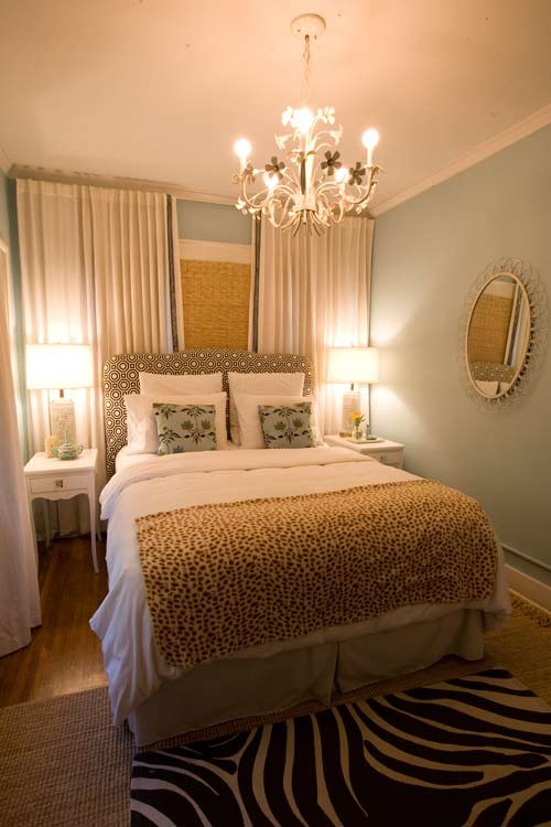
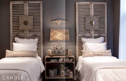
It requires a lot of patience to find the perfect end tables for a room. These tables are  part of your overall room design and you should follow some general guidelines to make sure they don't distract from your focal point or create too much conflict with everything else that is going on in the room. It's a delicate balance between your personal preferences and basic standards of design.

 Do end tables have to match the coffee table?

NO!  Having three tables in a space all matching sounds like a recipe for boredom in my opinion.  I know it's easy when you buy a set and  I know many homeowners opt for this solution, but I like a more curated look where each piece has obviously been given careful consideration and chosen for the space.  It is important that the pieces harmonize in the space or provide an impact whichever you are going for.

 Glenwood Residence contemporary living room


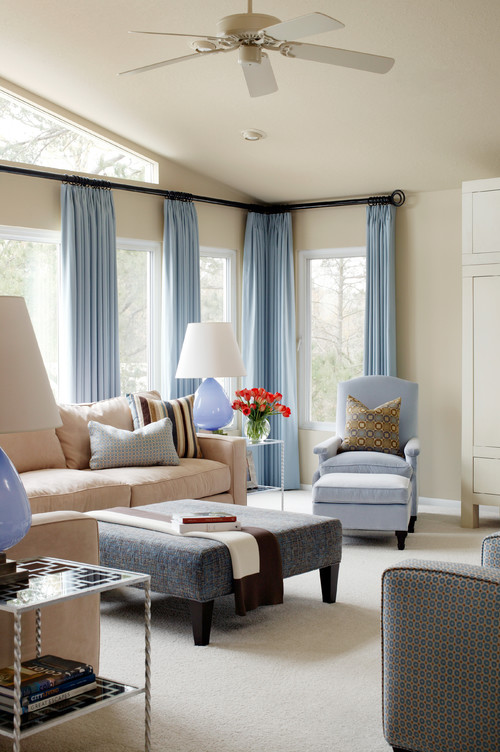
In this room the end tables match each other and are light and airy which is in  opposition to the coffee table which is upholstered and dark. While they don't match the whole room is harmonized.

Glenwood Residence eclectic living room

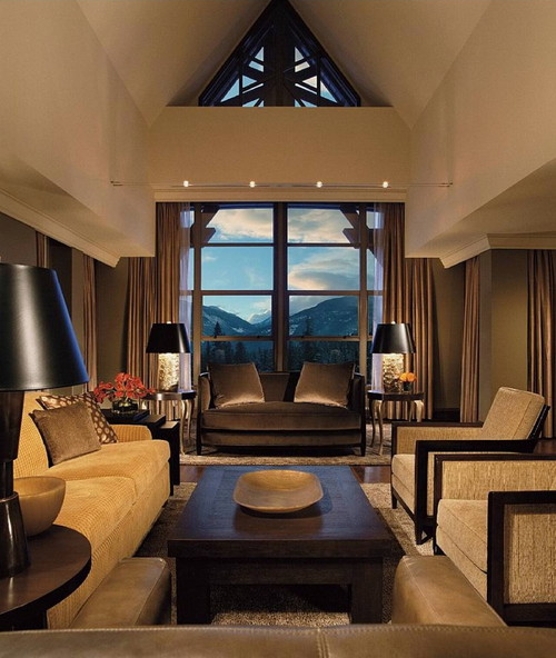
This is another living room design by Tobi Fairley which has matching end tables with a very different coffee table. I would argue that the end tables, while very interesting  in the overall design scheme, are too high.  I could see more than one elbow smacked on these! That leads to the second consideration.

  
What's the perfect height for end tables?

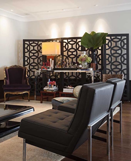
 By function an end table is usually placed by a chair or sofa and you have to lift your arm over the arm of the furniture to lay something on the table.  Remember function first.  They also need to be tall enough to provide a base for a lamp which should be a reasonable height to shed light.  24 - 26" is the usual  the  height of an  end table (some are as tall as 30in.), but the chosen table should work with the proportions of your other furniture.  A simpler way to say this is have your tables just  below the height of the arm of the sofa/chair. But these are guidelines. The round table in the room below is taller than the chair but doesn't look out of proportion with the other furniture.

While at CHil Design Group contemporary family room
 There are  also four different types of tables in this room and it doesn't look disjointed  because they are all in the same wood tones. When you have this many tables, a mix of shapes is imperative.  Some should be round  to play against all the rectangles.

Domicile id contemporary living room
Domicile Interior Design

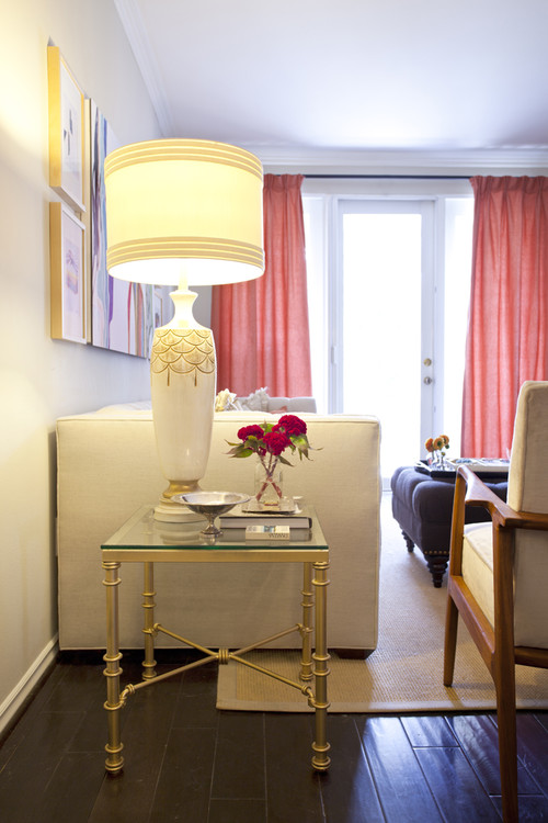
 While this is a lovely room, I personally find the end table too low for the high arm on the sofa.  You would have to reach way up and then down to place a drink on the table.  The lamp is also overpowering the table.   Tables and lamps have to work together, but that's a topic for another post. 
 

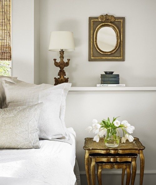
 Strictly speaking this is a side table, but the same principles apply to its selection. These nesting tables work beautifully with the lines of the chair.  I like the use of the floor lamp with this vignette rather than having an overpowering lamp on these delicate tables.Threes always make interesting pairings.

How do you choose a style/shape/colour?

Your end tables can match the style of your other furniture or they can make a statement by having a dissimilar style. There are many ways to go when choosing shape. A square shape is a good connecting piece when you have sofas or sofa and chair at right angles to each other.  It fits into the shape well and creates continuous flow.    Some may find it too continuous and seek out a round shape to soften the look.  

If you have soft furniture with rounded lines, a table with clean, straight lines adds variety to the look. The colour should be different enough so that it stands out from the floor colour.   If you don't plan to invest in an area rug on hardwood floors, choose tables that are lighter or darker than your wood floors. This is one of the biggest mistakes homeowners make when choosing  tables of any kind. I call it the disappearing furniture syndrome.

Jumat, 18 November 2011

Where do I put my bed?

 Some  bedrooms are so small that you have no option other than placing the bed in front of a window. Even in large rooms sometimes putting the bed in front of the window is just the right placement for it.  So much for "design rules".  It's all in how you do it!  

In some rooms that are narrow you can dress the window across the wall ending up with wall to wall drapes providing a soft backdrop for the bed.  When the headboard is upholstered you have the option to layer various fabrics for a totally soft look.  This solution can also rectify a window that is off centre.


Venice 4  bedroom
bed with custom hamper/bench eclectic bedroom
houzz

 But sometimes a room is so small and the window is so off center you have to just accept it and line the bed up with  the window and bring balance in other ways.


Elements of Style


An attic room is often a challenge to decorate because of the slanted ceiling and often lack of usable wall space. There's nothing like a pelmet and drapes to provide a picture like canopy for a bed. This room works  well because everything is so symmetrical and the window draperies frame the bed perfectly.

Elements of Style


 If you need  proof that  you don't need expensive draperies to make this look  work - here it is.  The Roman shades do the trick and the strong verticals point at the bed and support the perfect symmetry of the placement .  This is not a place were two different night tables and lamps would work. 


The gentle curve of this headboard softens the look of the bed against all the horizontal and vertical lines.  The vegetation outside serves as a gigantic landscape painting. If I were designing this room I would have played up the green angle  to make the inside an extension of the outside.   

Draped Bed contemporary bedroom
Michael Merrill Design Studio, Inc

Sometimes a window can act as part of a canopy.  This flawless design does everything right. Notice the bedside tables don't match and they don't need to.  This layout is more about strong verticals than symmetry.
 

Kamis, 17 November 2011

Thursday tip # 9 - small rooms

Stamford Bedroom Detail traditional bedroom
Hugh Jefferson Randolph Architects

There are many options when one has to decorate a small room.  These ideas are built on the principle of keeping all aspects of the decor as minimal and connected as possible. Since this is the look I prefer in any room, small rooms are never a challenge and I even prefer them. 
  • choose a monochromatic colour scheme (as above), or a neutral one with pops of colour
  • keep accessories in one colour range (in this room it's brass)
  • use multipurpose furniture ( stacking tables)
  • consider adding a shelf for storage/display to move things  off the floor
  • use multipurpose accessories (lamp that looks like a sculpture; interesting mirror instead of art work; beautiful boxes that can be used for storage
  • use many textures instead of bold patterns (in pillows, window treatments)
  • use furniture that is in proportion to the room
  • keep the lines of larger pieces simple
  • when choosing artwork focus on one striking piece and have anything else play a supporting role.  
  • use strong verticals to move your eye up (long drapes, vertical art work, tall slim lamps)
  • use your window as a backdrop for the placement of a prominent piece of furniture (bed i or chair)

Senin, 14 November 2011

5 ways to use a screen

I'm surprised I don't see more screens used in decorating because they are very versatile and there are so many styles to choose. Have you thought about using a screen in a recent home decorating re do?People have been using them for centuries in their homes beginning in 4th century BC in China.

 Through the centuries Chinese folding screens were ornately decorated with traditional symbols of health, prosperity, and joy and some were  painted with up to 30 layers of lacquer making them appear illuminated from within. In contrast, when screens migrated to Japan they took on a much different look  with their thin wood frames and paper panels. Eventually, the folding screen was imported into the West via European traders. Throughout history, the folding screen has had both decorative and functional uses.  Today the folding screen is still a multi-purpose decorating tool.

Create an accent wall

Large screens can be used as a backdrop along a plain, uninspired wall.  If you use one for this purpose it's important to choose one that fits the scale of the room.

Marcelo Brito - Sao Paulo - Brazil contemporary living room
Marcelo Brito

Often you will see an application that will prompt other ideas.  If I had this beautiful screen to work with I would put a  plain light coloured sofa in front of it.  The clean lines would show up well against the intricate design. Did you notice how the pot lights shine down on the wall behind the screen adding a layer of light? 

 Alessandra Branca

 Chinoiserie Screen are design classics. They add an exotic, dramatic  note to any room.  Since they are often multipanelled and quite striking they work beautifully as a major accent.  They will not be overlooked! Imagine this room without the floor lamps.  Would you like or dislike the effect?


I love the layered look of this room . The screen has been placed on top of a  patterned wall.. Pattern and textures have been employed so well.  The pop of yellow is a masterful finishing touch and it makes the black screen so much more dramatic.. 
  

This treatment is simple and very effective. I like the way the screen  extends and includes the night tables drawing everything into the largest element.  Keeping all objects close in colour/value makes this small room expand. This  screen would be so easy to construct from plywood or MDF and then cover with wallpaper or metallic fabric.
 
Use as wall art
 
Ral99 eclectic entry


Using a bench as a table and then backing it  with this fantastic carved screen is an interesting idea.  This screen would look equally good hung on a wall as a sculpture.

dining room modern dining room
twenty7 design

This  screen is quite stunning and sculptural.  It works so well with the contemporary furnishings. But what is that doll sculpture doing in the corner?


Laight Loft modern bedroom
Incorporated

Everything about this room hangs together.


Pueblo St Master Bedroom mediterranean bedroom
Lori Smyth

I'm not a lover of salmon and blue but it is very effective in this room. This room works because  large amounts of white was used to let the painting shine.

Fill an empty corner 

Breakers Project
 Phoebe Howard

This  screen does more than fill an empty corner.  It adds visual height to the space and draws your eye across the room while providing an additional texture.


Hollywood Residence eclectic living room

You can also use screens effectively to emphasize a symmetrical layout. The vertical flow draws your eye through the room.

 Make a headboard


This is quite an amazing colour! You could also remove one section and hang the two parts horizontally.

Sacha & Johans High Risk / High Reward Home House Call | Apartment Therapy New eclectic bedroom
Apartment Therapy

Who would not like this room?  I love the colour combination in addition to the fantastic headboard.  With the degree of intricacy  in the screen you need to keep everything else simple.

houzz

To think I was planning to send my louvered doors to  RESTORE!  This changes my mind totally.  This room works so well because all the elements are similar in colour. Nothing stands out; everything plays a subtle role in creating the whole.

Divide a room

 Downtown penthouse contemporary bedroom
 Amelie de Gaulle Interiors

Do you have a favourite use for folding screens ? Feel free to share.

Jumat, 11 November 2011

Inspiration snaps

When I travel my camera is always with me because I don't want to miss any inspirational moments for art or design.  I thought my readers might enjoy seeing some of the "snaps" that I found interesting.


This was the table decoration in the lobby of a boutique hotel in London.  Carnations last forever and made an interesting colour shape statement when pulled apart and floated on water in a very large stainless steel bowl.  We were there 3 days and the arrangement still looked fresh when we left.


I spied this chair poking out of an opened patio door in a restaurant in a small town in Devon.  It was instant love.  I wanted to put it in my suitcase and run. Purple gray and chartreuse circles on soft white-totally perfect.


Beautiful pottery in Beer, Devon.  I loved the orange and turquoise combination.


Leave it to Swedish design.  These candlesticks can be moved from a central base and reformed into various arrangements.Natural wood on the inside with dark chocolate stain  on the outside edges.

How functional and attractive can you get?   Just pick up the metal tray and go.Love the red one best of all and I have absolutely no red in my house.


In Prague we stayed at a wonderful hotel called Hotel Maximilian.  The service was excellent and the decor was modern. I was very attracted to the orange and gray combinations and the chairs were super comfortable. The vases were by local artists.  There's a strong history of glass production in the city. 


Loved my black and white modern bathroom in a Holiday Inn Express in Dresden.  I'm getting ready to redo my own bathroom and I love there long rectangular tiles stacked in this way.


So sculptural and perfectly purple in the same hotel.  How lucky to find such great accommodations at a good price when travelling.

Kamis, 10 November 2011

Thursday Tip # 8 - make it white

Coastal Living

There is something so soothing about a monochromatic colour scheme.  I have friends who would say boring not soothing. but to each his own.  It might seem easy to have a room is varying tones of one hue but not so.  It's even more difficult to design a white room to look interesting.  The trick is to emphasize shape and texture through repetition above all else. Don't forget that there are hundreds of whites with varying undertones and temperatures.

Why does this room work?
  •  white shows up all the textures and lines in the room;
  • the small mirrors arranged in a grid add a strong repetitive element and each looks like a small painting because of the reflections from outside (I'm assuming); that adds optical texture;
  • the walls are horizontal boards which play against the square mirrors;
  • apart from the texture of the white boards, the horizontal lines are soothing and are repeated in the cabinet below: 
  • the arrangement has various shapes( cones, spheres, stars) and surfaces (reflective, matt, rough, smooth);
  • shiny surfaces add an unknown quality because you never know what will be reflected;
  • the whites are on the warmer side and a little "dirty" which doesn't look stark.
Here are several other white rooms.  Do you think they are successful? What do they have in common with the room above?

Elle Decor


Marcelo Brito - Sao Paulo - Brazil contemporary dining room
Marcelo Brito


Which do you prefer? 

Senin, 07 November 2011

Subtle adjustments

Small changes can create large impact in design; sometimes the changes are not so large, but there's an improvement.  Either way move around your home with a critical eye for small tweaks you can make... add a pillow here, reposition artwork, remove a pile of books...

 When I am at my summer home, I often have too much time on my hands so things get moved around quite a bit.  Here's an example of a small tweaks adding a little impact and interest.  Remember this is a summer home , so everything in it is recycled from somewhere else.  Isn't a summer home all about looking good on a budget which includes lots of DIY? 


Remember the days of cloth covered tables?  This table is a left over from that era and I repainted in the current colour scheme. I've tried to retire it several times, but I like the open, legginess of it.  Both objects on the table interact in a nice way  but there are only two of them.  You need at least 3 for interest. Let's look around...

 Found some books (surprise, surprise) and a small painting I bought in Paris in 2001 (look in the window and see the Eiffel Tower reflected). Now we have a classic checkmark design with the picture at the lowest point.  Varying heights always add interest. But it could be better.

 Now you can see the lamp base and the checkmark is wider at both ends.  I like things more open.

 I've moved from a checkmark design to a classic A shape with the tallest object in the middle and each object is a different height. I like it.If the dolphins were facing out this would make the design less cohesive.

Still an A but not as interesting for me.  The dolphinsneed to be moved away from the lamp base (they look like they're sniffing it). Also notice in these pics how a camera changes the wall colour. The third and fourth pic are closest to the actual colour.

 Start looking to see where you can make  subtle adjustments. 

Jumat, 04 November 2011

What's your kitchen style?

I like my kitchens clean lined, and light  with lots of storage.  Medium to dark wood tones  make me fell heavy and closed in.  It's a personal preference and that usually  gets left behind when you are designing for a client.   In my locale there is a strong trend toward darker kitchens with the richness of wood showing through.

Photography: Brian Ricks
 
  Sometimes there are factors that negate the cave feeling I often get from dark wood cabinets. In a recent job this sleek modern kitchen design won me over.The client had very definite ideas about the overall look of everything so my job was to tweak the colours and problem solve space and placement. The cabinets couldn't extend all the way across because the depth beside the window was only about 10 inches.  Open shelving for glasses was the solution. 

 
Photography Brian Ricks
 
The second problem was storage because there weren't many upper cabinets. This  was solved by making the peninsula wider to include lower cabinets  facing the bar stools and drawers on the opposite side. The openness of the space around the peninsula makes a great gathering space when there's company.
 
 
 Photography: Margaret Ryall

 
I love this back splash tile. It is difficult to see but it is three dimensional with an alternating wave pattern between the squares. The tile and exhaust fan run to the ceiling for a seamless look. The tile also extends across the top of the cabinets to finish the look.  
 
Breaking the line of deep upper cabinets with 12 in ones by the exhaust fan added variety to the space.   The pulls varied in length with  depending on door size.  The 12 in. upper cabinets needed knobs because long bars bumped when the doors opened. So many things to think about!
 Photography : Margaret Ryall
 
A highlight of the kitchen detailing is the stainless steel counter beside the cooktop. The colours in the backsplash tile are a blend of the tones in the granite on the peninsula which serves to connect the two spaces.

Rabu, 02 November 2011

Thursday Tip #7- Editing a bookcase

Control your bookcase

If you're like me this is easier said than done.  I don't like a bookcase to look too edited, but grouping objects and books is a must.  I won't go so far as to suggest covering books with the same colour paper  or lining them up by colour as I've seen in some magazines.  

What works in his arrangement ?
  • the bookcase has been treated as an accent wall by painting the back a beautiful blue
  • sculptural objects are massed and are  the same colour - white- which shows against the blue
  • there's a range of objects including books, vases, photos and found objects
  • the books have been sorted by height
  • books are placed both horizontally and vertically
If you wanted to further edit this arrangement you could consider:
  • removing the photos; they are lost in the display
  • if you are arranging books horizontally, keep to that, don't start to stack vertically on top of the horizontal ones; stacking some horizontally and some vertically on the same shelf works
  • don't add a piece of sculpture on top of a books (see bowl) , this is sculptural enough to display alone and gets lost otherwise.
  • if you have an arrangement of vases, bottles etc.  don't add a picture behind it- it gets lost.
 From one extreme to the next...


 Quiet and unobtrusive, this bookcase provides a lovely backdrop for the two chairs grouped in front of it.  This is a room I would like to sit in .

 
HGTV

This is a whole other way of  organizing a bookcase.  While is is ordered, it has a very vibrant almost chaotic feel to it.  It has way too much visual energy for my taste, but there's someone who loves it. 

If you want more inspiration check out The Lennox,  a great blog that I follow.

Did you find a useful tip  in this post or do you have one to add?

Happy Shelving

Related Posts Plugin for WordPress, Blogger...