Senin, 31 Desember 2012

Are decor trends important?

I am interested in following the latest  trends in interior design.   I need to know these things to have relevant discussions with clients and to understand where the industry is headed.  Many  trends come and go without ever hitting the average home.

Colour of the year is a good example of a temporary trend.  Depending on which paint company your like, you will have a different colour of the year!   I use Benjamin Moore paint and this year the colour of the year is ....
 
 Lemon Sorbet 2019-60

This is an interesting fact to know, but I doubt this time next year it will make much difference  because there will be a new colour of the year.

 Then there are broader colour trends that seem to last for much longer, e.g., the change from beige/brown to grays as the predominant neutral in home decor.  This type of information  is  more important to be aware of because it produces whole palette shifts in home accessories including textiles. The  change to grays has moved palettes from warmer and earthy  to cooler and cleaner colours.

 Rather than the burnt orange/rust  of the brown/beige  era


 you will now find  a more true orange mixed with grays.


 Rather than olive/mossy greens of the brown era...


  you will find fresh apple greens.

You can have such wonderful pops of colour with grays and this is reflected in the vibrancy of home accessories available in the market place today. 

 Several years ago I looked for emerald green accessories for a client.  It was almost impossible to find any!  Pantone's colour of the year for 2013 is...


I find Pantone's colour predictions have more impact on fashion and home decor than those of specific  paint companies. This year you will have no difficulty finding emerald green accessories.

 It is important to keep up with trends that will  impact big ticket, relatively permanent products like hardwood, tile and cabinets.  You do not want to select something that will be dated  quickly.  Awareness of these trends does not mean you have to buy into them.  Sometimes choosing exactly the opposite is the the best design solution for longevity.   That is why it is wiser to choose  more neutral  long term items for your home.


Homeowners  who jumped on the dark wood look  for kitchens will probably end up sorry for their selection sooner rather than later.     Extremes rarely work for long periods of time. I predict the patterned glass mosaic backsplash tile that is all the rage now  will have run its course soon too.


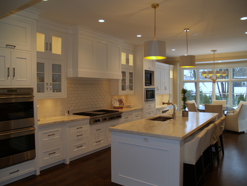
That's why classic soft white kitchen cabinets will always work. There are no extremes in this kitchen.   The style is softly traditional, the tiles are plain and the counters are  lighter granite.   I know it isn't everyone's cup of tea.  I am talking about what stands the test of time.

 
Staying with a traditional example, if you don't like white, consider a more mid tone neutral  or  ...


  mid toned stained  wood. 


Stay tuned for 2013 decor trends with staying power. 


Danish interior inspiration

So guys, it's almost time to say goodbye to the old and hello to the new. And, personally I'm soooo excited about what the new year may bring. From an interior design perspective, the Danish brand House Doctor Spring/Summer collection 2013 is leading the way. Here's a sneaky peek.


Via House Doctor blog and Decor8

Wow. I love the touches of pastels and greys against the industrial backdrop. Very cool. 

So, NEW YEAR'S EVE! What are you up to? Any exciting plans?! In case you're hosting a dinner party you can find some fab last minute inspiration for decorating your dining table here, here and here

Have a really fantastic night and see you next year! x

Jumat, 28 Desember 2012

Antwerp home of a graphic designer

You just know that the home of a graphic designer is going to be pretty cool, especially when they have an Art Nouveau house to play with. Davy Dooms, has made a bit of masterpiece out of his 850 metre square living space in Antwerp with all it's cool scandinavian designer touches. I also love the way photographer Niko Caignie has photographed it for Remodelista using interesting angles.


Niko Caignie via Remodelista

What do you think? Your kind of home? I love the wooden touches used to soften and add warmth to the look and enjoy the clean lines, although, you know me, I could never be as orderly as this and would definitely need to add some feminine touches.

I hope you all enjoy your last weekend of 2012! See you Monday (aka New year's Eve! - woo hoo!).

Kamis, 27 Desember 2012

Malmo designer pad

Hello everyone! Hope you all had a fab Christmas, whether you were knee deep in snow, on a sunny beach somewhere or braving the rain like we've been in London (it's still coming down in rods!). If you're in need of a haven (like we are!) how about this pad currently for sale in Malmo?  Spot the Scandinavian designer pieces and cool photography....


Bjurfors

I spy Eames side chairs and Charles & Ray Eames Lounge chair and ottoman (15% off with MYSCAN). I love the black and white photography and the 'hug me' cushion, any idea where this is from?! But most of all I'm coveting the dressing room. My new year plan is to create a great walk in wardrobe and dressing area and this will be part of the moodboard - I think it's the casual meets orderly approach I like.

What are your home projects for the new year?

Selasa, 25 Desember 2012

A little red year round

Red  is a great accent colour anytime, but it seems to be even more inviting at Christmas.  All it takes is the merest hint to bring a room to life. It can be used in small accessories, window treatments or furniture.  In all can't be ignored.

accessories red
A splash of red always works

What a difference a pillow can make.  Remember to have at least three hits of an accent colour around a room to create movement.  

red furniture with black
Black and red are very dramatic

Red and black is always dramatic, and when your throw a bold pattern into the mix it is even more so. 

red patterned bar stools accessories
Stunning patterned bar stools

 Red and gray is refreshing.  I especially like this crisp blue red with a white pattern. Three hits of colour is well displayed in this vignette. 

A sprinkling of red

Red paired with black and white patterned area rug is very eye catching.   What an interesting window treatment for more than one window set close together. Vertical stripes are so commanding. 

red sofa black and white pillows
Who could ignore red with black and white?

 Bold black and white again with a red sofa.  Very commanding.  When you are hanging artwork on a striped wall it is best to keep the mats light and the images simple. 

red and white striped headboard
Red and white striped headboard

A striking red striped headboard with charcoal and white. 

red console
A stunning red console

Red with liberal amounts of neutral always works.


Jumat, 21 Desember 2012

Merry Christmas!


My Scandinavian Home

Thank you all so much for reading my blog and leaving all your lovely comments this year.

I'll be back here, Pinterest and Facebook on 27th December,  in the meantime I hope you all have a really wonderful Christmas!

PS If you're in a last minute rush for pressies, click over here to see my gift guide!

Wrap it up

Trying to be earth friendly is an ongoing battle especially at Christmas.   I hate the fact that all the pretty gift wrap ends up in the landfill because  it isn't recyclable.  paper gift  bags work for me and I always reuse  those I receive. I  also purchase fabric bags when I see them and hope the receiver  passes them along to another person. When the last of my gift wrap runs out (probably this year), I plan to use brown paper (Kraft Paper) which you can recycle.  The options for dressing it up are endless. Here's a few nifty ideas to get you thinking about the possibilities:

  Braided wine, a bit of greenery  and a pine cone.  What could be simpler than that?  Wrapping the twine around the package off center adds to the design element.

 What a great way to share old photographs.  Copying them is so easy these days.  


Love how the black satin ribbon looks with the green and the stamped gift tag.  The splash of cedar finishes the job. 

 The name of the recipient becomes the major design element in this wrapping idea. 

  Have you seen the lace tape that is so popular now ? I've been on the look out but haven't found it yet.


Cutting snowflakes from different coloured paper and adding them to the plain paper works to add a spalsh of colour.  Simple butcher twine manages to look elegant with this pairing.

 Who know the pages from old books could make such pretty wrapping material.  You can sew paper to make bags or else glue the edges together.  Adding red string makes it all so festive. You can do so much with so little!
I love this one with red yarn and kraft sticks with holes drilled in them. Of course it is the repetition that makes the design.

 Love this look with red raffia ribbon and strips of black and white printed paper.  What you add between the raffia is up to one's imagination.


 Coloured tape and a button on a string.  How colourful and simple?

 To get this effect I would use scraps of tulle or netting  and then over tie it with twine. 

Wondering what to do with that left over burlap?  Wonder no more.  I made burlap bags years ago to package driftwood Santa's I hand painted.   When you ravel out the tops and include a colourful yarn for tying , it looks very festive.  Burlap will also take a simple stencil using  paint.


 Over wrapping newsprint with burlap and adding a lovely gift tag and pine cones looks very finished and inviting.

 Find the links to these and lots of other gift wrapping ideas on my Pinterest  gift giving page.

Related Posts Plugin for WordPress, Blogger...