Selasa, 30 September 2014

A Skåne apartment with a lovely autumn feel

Hello October! What a lovely month. One of my favourites in fact, how about you? These images, by the very talented Skåne duo Emma  Persson Lagerberg (stylist) and Petra Bindel (photographer) have been doing the blog rounds lately. I first spotted the feature in Swedish department store Åhléns's magazine last month. The way this beautiful apartment has been designed and styled perfectly sums up the Autumn mood don't you think? I especially love the green, grey and brass theme in the sitting room and the kitchen's pretty cool too?!


Stylist: Emma Persson Lagerberg. Photographer: Petra Bindel. For Åhlens. Via 79 ideas and Nordic Design with thanks

Oh so beautiful. Is this your kind of style?

You can see more examples of spaces Petra has photographed herehere and here.

If you find yourself in Sweden (or Norway) definitely pop into an Åhlens, they have such a great home-ware and women's clothes section selling fabulous Swedish fashion labels such as Hope, Filippa K and Acne.

Have a lovely day! 

Senin, 29 September 2014

White Swedish apartment with great art

This Gothenburg apartment caught my eye this morning, it's just what I'm in the mood for! White wood floors, fun artwork, beautiful arched windows and a standard hydrangea in the bedroom - why not?! I could work all day from that table by the window, how about you?!


Stadshem with thanks
I see a few lovely items including: the G playtype print, HAY tray table and DLM (Don't Leave Me) table, Thonet 214 chair, Sheepskin rug, HAY dot hallingdal cushion. Find vintage industrial pendant lamps on etsy. Hmmm, what else, what else?!

Could you pad around here today?

Have a lovely day!

What fall brings


Yes, it's that time again.

Beautiful Duntara, NL
Bridge, Duntara NL
My Duntara neighbour

My love for Duntara began in my teens when I spent my summer vacations there with my Aunt Mary in the house above. Life has come full circle since 2002  when we built our own house up the road  from Mr. Harty's place. This harbour is particularly  stunning in fall. Everywhere I look I see natural beauty.  As summer winds down it becomes quiet and even more relaxing if that's  possible.

"Around the bay" dining  table
 Finding natural things for decorating  my summer house becomes more difficult in September, and I accept it as a sign that it's time to close up and move back to my  St. John's life. As  I make the  final drive back to the city I can feel myself subtly changing .  No more rocking chair as I watch the sea gulls swoop and meander .  No more ocean waves or full moon over the bay.  No more twinkling lights of Bonavista across the  water. No more total silence.  No more summer friends.

 Fall means something quite different in my life. It  heralds the reality of  my peak production time for design and blogging, and a decrease in art production.   Reminding myself that the ease of the summer months would not be so special if  I could do it all year helps a little.  But that final trip out is always bitter sweet.


City dining room table
Now doesn't the differences between these two tables sum up my two lives.

 So it's planning time.  September is the month when I  feel anything is possible.  It's about deciding where I want to go and coming up with a way to get there.

I've been putting a lot of thought into  the next step for this blog.  My original purpose was to use blogging as a way to consolidate my ideas about various  design topics,  and at the same and provide practical information about design that would answer questions that average  DIY homeowners might have.  I've written about all sorts of topics and my list of  popular posts shows which have been  most read, some  with  hundreds of thousands of page views from around the world.  That always blows my mind.  Now I'm ready to  change it up a bit.

Third Weekend in October, 85 x 110, quilt pattern by Ruth Powers
  This fall I am  planning more local and national posts about interior design, art and gardens- my three loves.  I have friends lined up who are willing to open their doors to me so I can photograph and write about the many ways they make their houses into homes.    If you know me you may be getting a call.  Stay tuned for my first AT HOME installment.


A black, beige and pink Stockholm apartment

Hello! I hope you had a great weekend? I thought I'd start the week with this very cool apartment in Stockholm designed by Pella Hedeby and Marie Ramse  (you must check out their blogs!) for JM. The clean lines and black, grey and a hint of beige /light pink colour palette have been used to highlight the beautiful architecture (by Gert Wingårdh) and create a serene feel. I particularly love the colour on the walls in the sitting room and in the children's bedroom, how about you? And what do you think of the black walls in the bedroom? I think they're kind of striking.


Interior: Pella Hedeby & Marie Ramse. Architecture: Gert Wingårdh. Photography: Kristofer Johnsson

The children's bedroom palette reminds me a lot of a top from Stockholm based brand Mini Rodini my little girl tried on at the weekend (so cute!).

Could you live here?

This weekend my family and I visited Kungsbygget which is about an hour's drive away here in Southern Sweden. The countryside was stunning (there's a pic of our bbq spot on instagram). Kungsbygget has a 1 km zipline (terrifying but so much fun!!) and a summer bobsled run which my girls absolutely loved. If you're ever in this area I can highly recommend it, it's such a fun place. In the winter it's open for skiing too. Do you have anything like that near where you live?

Have a wonderful Monday! 

Favorite Small Kitchens that Live Large


Mix It Up
Including original pieces, like the built-in hutch, has classic appeal and gives a subtle nod to the home's original design. The high-contrast color combination adds drama and helps the room feel fresh and modern.

Precise Pullouts
Narrow pullouts across from the island keep oils and vinegars within reach of the cook. The pullouts' different shape breaks up the cabinetry and echoes the home's original style.


Sky-High Storage
In this 1920s home, a kitchen remodel was necessary to make the space feel fully functional in today's day and age. Taking Craftsman-style cabinets all the way to the ceiling increases storage without making the kitchen feel closed in. The sleek stainless-steel range hood has a distinctly modern vibe that matches perfectly with the island stools.


Beautiful Banquette
A new custom-built banquette adds convenient seating within the kitchen. With classic wood paneling and molding, the bump-out looks as though it is straight from the '20s. The color combination of white and gray leaves the space feeling elegant and timeless.


Nook for Necessities
A storage-packed nook houses an oven, microwave, and customized cubbies. A small countertop with a coffee bar is the perfect place begin each day.


Increasing Efficiency
In this home, a 1970s galley kitchen was transformed into a sleek and stylish alternative. By replacing windows at a higher level, additional counter space was able to be added, increasing the kitchen's efficiency when it comes to cooking.


Layout Change
A wall that separated the dining room and kitchen was taken out and left the kitchen bigger and brighter. With chairs on both sides of the peninsula, the bar is a full-fledged dining space.
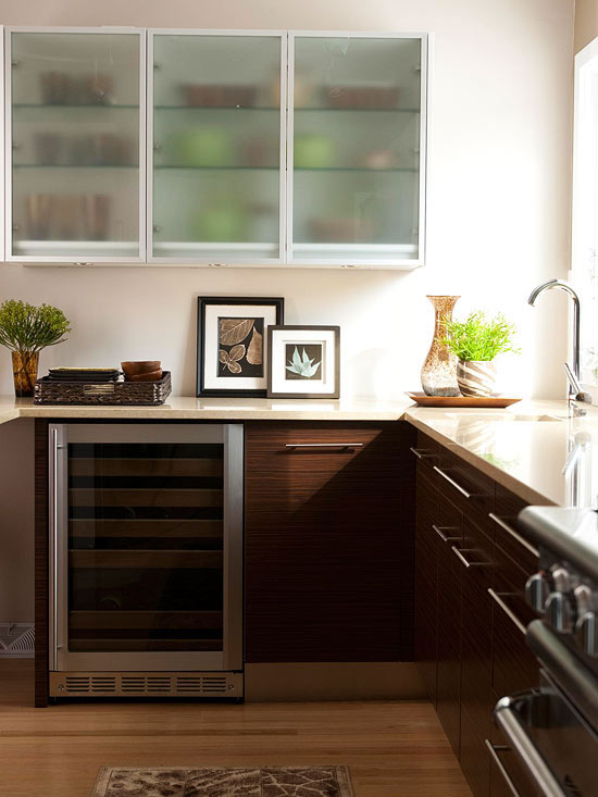
Cabinet Combination
Mixing cabinetry makes this kitchen feel modern and unique. When combining different types of cabinetry in the same room, keep lower cabinets darker and upper cabinets light. Here, semitransparent cabinets help the top of the kitchen feel spacious, while dark-stained lower cabinets help ground the room.


Corner Storage
A pullout corner storage unit maximizes often-unusable space, and an automatic light inside the cabinet makes it easy to find items. This pullout cabinet is a custom add-on, but it makes an awkward cabinet usable.


Simple Storage
Storing dishes in lower cabinets prevents having to lift them overhead and eases the task of unloading the dishwasher. Drawers and pullout shelves are often used in lower kitchen cabinets to avoid dark corners where items can get lost.


Utilize Forgotten Spaces
In this petite kitchen, creamy cabinetry helps to make the space feel more open while a light blue paint appears to raise the ceiling. A counter-height bar allows for a place to eat as well as additional prep space for cooking when the chair is taken away. This kitchen shows how forgotten spaces can be used to instantly increase storage in any kitchen.


Corner Cabinet
Installing corner cabinets provides additional storage without impeding on walkway space. On the counter, there is space for a small coffee center that is out of the way of kitchen traffic.


In Between Spaces
Between upper cabinets and the countertop is the perfect space for a small television screen that doesn't obstruct the counter. For the kitchen backsplash, taupe subway tiles combine with thin bands of blue and brown tiles for a simple and clean look.


Instant Organization
Insert risers and organizers in drawers and cabinets to pack lots of ingredients in a small kitchen. Here, simple wooden inserts allow for multiple spice jars to remain organized and always on hand.

Height Trick
To make the small kitchen feel more open, the cabinets were run to the ceiling, giving the appearance of higher ceilings. The light maple cabinet finish and buff-color granite counters and travertine tile backsplash play off the natural theme of the room and create a soothing, cohesive look.


Smart Moves
Clean lines, plenty of white, and an abundance of light spell success for this small kitchen. The room feels unconfined by its 11x11-foot footprint. Although small in square footage, several smart design strategies open up the area for a statement-making space. Understated and sophisticated finishes, such as the white backsplash and glass-front cabinets, keep the room simple and inviting.

Invigorating White
Too much white can be a little dull, but the neutral hue perks up when used in standout ways, such as on these beaded-board cabinets. The grooved design adds texture to a flat, white surface. Wide white crown molding between the cabinets and ceiling tops the room with a final detail.


Finishing Touches
Although a colorful tiled backsplash would have added visual interest, a clean, white mosaic version was a more fitting choice for this kitchen. The simple design stays in step with the room's airy vibe. Accessories and extras, such as a copper light fixture and potted plants, introduce color.

Beach House Decorating Ideas

Here are a few tips on beach house decorating styles to assist you create a fabulous retreats. 

  • Beach house decorating is about imitating nature’s own color palette; keeping your house uncluttered and relaxed. It is a mindset of serenity and peacefulness. 
  • When choosing interior paint colors you want to imitate the color hues from the water, sky, and sand. Use colors such as soft blues, light greens, coral, sand tones, and sheer pinks. The right color choice can really bring out any tropical decor.
  • Don't be afraid of color. Decor with fun fabric on an outdoor bench to create a fun and happy looks.  Hang the "Welcome" sign on the colorful door to create a welcoming mood.
  • Find a large basket and fill it with oyster shells, or sea shells. This is a cheap decorating idea that looks wonderful.
  • The wonderful thing about finding beach theme decoration is that you can find many things that come from nature. Sand, sea shells, rocks, coral, driftwood, and rope are just a few natural beach decor accessories. Just tying a little raffia around the candlestick added just the right touch. 


Related Posts Plugin for WordPress, Blogger...