Senin, 30 Januari 2012

What to hang over a fireplace


If you were going to hang something over a fireplace, what's the first shape you think of ?  I bet it's not a circle.  Most people would think rectangle, but I would like to suggest  going against that natural inclination and putting a shape there that plays against the straight lines of a fireplace.  What do you think of the impact a circular motif makes?


 While the art is square you hardly notice the frame.  It's the circular mark making that catches the eye. 


An empty frame with two other objects creates great impact.


 A circular mirror with a mirrored frame sits back quietly while the blue accessories do all the wow work.

Shiela Off, CMKBD eclectic living room 
Houzz

A simple round mirror bordered with driftwood.  This is an easy DIY project. 


This vine that has been fashioned into a loose circle is calligraphic in its statement.

This  Austin branch mirror provides the best of both worlds, a lovely circle and radiating branches.

Sabtu, 28 Januari 2012

Sneak peek

It seems I've been in the middle of a bedroom update forever.  It takes so long when you are doing things yourself.  This is the before picture.  My husband loves black and I love geometric patterns.  Everything in this picture including the carpet and window seat are gone or going.

The new look will be the opposite to the strong contrast of this one.
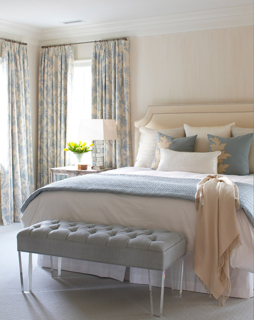
The new look:
Soft and serene, no one thing standing out- harmonized to the hilt
Lots of textures and gentle patterns

 My new duvet cover is very patterned but soft looking.I'm still working on accessory pillows to play with this design. I like to do that when everything else is completed.


 Love this basket I found at Winners.  Don't like the dark interior so a little spray paint will be in order.  I want some  very tall  natural colour sticks to put in it.  Still looking.

 New light fixture from Rona.  I spied this when I was shopping with a client and loved it.  When I went back to buy it,  both styles were marked down to $20.00!  I bought  one of each.  Here's the other style just waiting for a new home possibly in my summer house.


 My refinished oak mid century modern bureau.

 
   Can you believe that I had this beauty in my studio? I stripped it, sanded, created a grayed green wash (water and paint), brushed it on, wiped it off, dried overnight,  and then applied a coat of satin varathane. I left the exposed border and areas behind the drawers natural colour.

You can see that I like my hardwood light no matter what the current trends!  This mirror is temporary until I can bring the one I want back from my summer house.

 Handy hubby made dividers for the skinny top drawer and now I have a very tidy storage space for all my jewellrey. 

 New tray from my sister, two vases originally black got the spray paint treatment. Still working on the arrangement of all these piece and still collecting.


One of my  mixed media art works called Turning Point, new drapes which are tone on tone with the wall colour - Benjamin Moore AF Collector's Item.  I can't praise this colour enough if you want a warm, soft neutral for any room in your house.


More art work.  I'll always love this piece created by a friend  Cathy Driedzic.    I'm working on a new painting for over the bed. 

 This trunk/bench  is currently being used in place of my built in window seat which had to be removed to lay the hardwood.  Haven't decided if it will stay here or go to the other side of the room where is originally resided. Colour Benjamin Moore AF Wind Chime

 How it currently looks.  Painting is coming down because it is lost in this space. One nail hole to fill in. It will probably go on the wall by the closet - nice narrow space for it.

An there you have it.  We are moving to a king size bed and trying to decide on a design for hubby to make.  Too many ideas, too many discussions, and not a lot of patience because I want it done, like yesterday.  The full reveal will come later. 


Kamis, 26 Januari 2012

Details- gray vintage


Some images need to stand alone to enable us to thoroughly enjoy all the nuances they contain.  Because  too much text can wear out an image as well as a post I'm  planning  a series of posts titled Details that highlight things that please me visually.

Gray is not everyone's cup of tea, but it's been my neutral go to colour since the mid 80's.  Gray is actually a very complex colour and it's "nature" is defined by the colours that have been neutralized to make it.  

The details I love:
  •  the shape of the vintage credenza with all those drawers
  • the variety in the values of  gray used
  • the high sheen on the door makes it stand out from the other more matt textures
  • the one hit of colour in the flowers
  • the ornate crown mouldings contrasting with the simplicity of everything else
 is there anything about this vignette you like?


Jumat, 20 Januari 2012

4 ways to make pattern sing

Adding pattern to a room is one of the quickest ways I know to create excitement in decor.  A room without pattern is a dead room.  If you want to play it safe add your pattern in smaller punches, e.g., pillows, throw or small area rug.  Here are several quick and easy  tips to have you decorating like a pro. 

 Vary the type and scale of patterns used


Personally I would not have this many pillows in a row but the patterns really work well together.  Start with a large scale print in the colour scheme you want (floral above) and choose the others based on this. Note how the linear geometrics vary in colour and size - always a good formula.  The circular raised flowers in yellow play well with the larger floral and pick up on the colour of the larger geometric.

Keep the patterns in a tight colour scheme - complementary is easy

Sunburst eclectic living room
Caitlin Wilson via Houzz


This is a more adventurous use of pattern  when you consider the wall and the ottoman.  Similar to the last  arrangement, this one uses a large scale print as a departure point for the colour scheme.  A smaller and larger linear geometric is chosen  in complementary colours.   If you want to have a lot of energy add pattern to the wall in yet another pattern.  It's too much for me, but I'm pretty plain in my tastes!

 Break up pattern with a solid 

Punta del Este Beach House contemporary bedroom
 Z3 DiseƱo

This is a pretty intense pattern but it is played down by using white and a solid colour in pillows.  If the chest was painted white the pattern would be further controlled.

Play down colour, go neutral


Photography : Margaret Ryall

Kamis, 12 Januari 2012

Bathroom renovation woes

Sometimes having too many ideas is just as bad as having too few.  I am definitely swimming in the idea pond when it  comes to my main bath renovation.  Right now  the space  is a product of the mid eighties with white square tiles, gray fixtures and a white European vanity and upper cabinets.


  Everything has to go and we are taking out the tub to put in a walk in shower. I can't stop dreaming up new ideas, so I'm using this post as my own sounding board. Hopefully it won't be all personal and you, my readers, might find my sorting process of some help in any home changes you  have planned.

The look I like:
  • overall design more contemporary than traditional
  • simple, clean lines, not cluttered (lots of storage options)
  • soothing, natural colours  which are not too cool -  warmish neutrals) 
  • lots of texture (always a must in my house)
  • weathered wood in gray driftwood tones  (a favouite since I was 20 and that's many years ago!) or light to medium wood tones - nothing dark and heavy.  I rarely follow trends in my own home decisions.
  • brushed metal finishes, raised basin but not too high
  • mixture of tile sizes depending on placement, no obvious/contrasting border
The inspiration shots:


contemporary bathroom ideas contemporary bathroom
 Dick Clark Architecture

This room is light, airy and has very clean lines.  There are options for storage,  but things could get cluttered because  everything would be exposed.  I  like the wood tone but the small glass mosaics may quickly become outdated. The square tiles are a little too predictable. So I'm left with the wood tone!

 South Shore Residence contemporary bathroom

LOVE the shape and colour of the vanity.  It has both open and closed storage so it fits the storage bill.  Hubby could  whip this up in several days!  I also like the grain in the larger floor tiles.  Looking good. 
Best Builders ltd modern bathroom
Best Builders ltd

Floor and vanity fit the bill in every way.  Colour tones are my favourite, the wood grain tiles are fantastic and  you could run the same tiles up the wall of the shower and alternate with a small scale tile on the floor of the shower. It's good to keep the same tones in all the tiles used when you are working with a small space.  

Master Bathroom contemporary bathroom

Tones in this vanity are a little warmer and I love the shape. All storage is hidden and  I'm attracted to the  textured wall and the full mirror with a ledge. 
Best Builders ltd modern bathroom
 Best Builders ltd

 Love the color tones in this hideaway storage (slightly purplish).  This idea could be fitted into the right and left side of the vanity to look like doors.


I first saw this picture in a magazine and I've kept it.  I love the vanity colour and shape. It's very mid century modernish in styling and I have other pieces similar in my house.  It is an easy style to replicate (I know I am lucky to have my own furniture maker on the premises.)


While at CHil Design Group contemporary bathroom
 I like the idea of using the textured stone as a backdrop for the vanity and mirror but it would work best if you have a defined space between two walls.  I don't. 

While this counter is  slightly too golden for my tastes, I like the layout , cabinets and the space for hanging a towel. One of the things you have to consider when you have side cabinets is how the light will reach the rest of the room if you don't have a ceiling light. . 


Master Bathroom contemporary bathroom
Then there's always white, but all the other vanities in the house are white so.... . maybe not.  I like the storage, the legs, and the wood grained tiles.

I'm getting there...  Stay tuned for more updates on this 2012 reno.

Minggu, 08 Januari 2012

DIY wow factor for walls

If I had oodles of money I would buy all the art my heart desires and I would have more walls!  In reality I have an interesting  art collection that I've grown over time , but not all of my wall decor is fine art.  There are so many other things you can do to add a WOW factor to your walls without breaking the bank.  Here are some of my favourites.

Enlarge and frame print material


Display your collections artfully 

Pinterest


Use wall paper and fabric in creative ways


Frame post cards, pages from old books, or photoographs


Spray paint sculptural objects
Hope there's an idea here for your walls.

Jumat, 06 Januari 2012

Is your home matchy matchy?

What is matchy, matchy?

The term " matchy matchy" in decorating refers to rooms that are too coordinated because of the use of the same types of colours, patterns, fabrics, thematic elements etc.   It  has negative connotations and evokes overtones of boredom.

 I describe the desire to have everything matching perfectly  in a room "over matching". Rooms put together in a catalogue or in a model home are good examples of this look. Everything matches and the room looks soulless.

Over matched decor
JC Penny Catalog

Matched with interest
source unknown

This room is a step up from the one above it  because of the pattern in the rug, variety in the pillows and interesting art work.  The wood tones are still very matched and the coffee and end table are a set, but both have added accessories which make them a little more interesting. 

Buying sets of furniture; matching bedding and draperies; replicating the same colours and patterns in accents; keeping all wood tones the same; choosing art to match the decor; and so on, are actions that lead to an  over- matched look.

Old Greenwich Beach Cottage contemporary bedroom
Harmonized decor with patterns, textures
 

What is a harmonized room?

An advantage of overly matched decor is the sense of calmness that you  get from it.  Nothing is disparate; you feel at peace.  The room above is very inviting  as a bedroom.  While the colour scheme is very matched, consideration has been given to a mix of furniture  that works very well together, and there is variety in the textures and shapes used. I would describe  this room as "harmonized".

On the  continuum  of well designed rooms it is moving toward the middle. in my opinion what this room could use is more interesting accessories.  It comes across as rather bland and does not reflect  much personality.  Further along the design  continuum and much more individual in its appearance is  the curated room.

 What is a curated room?

 Curated rooms appear to be collected over time rather than created in one go. Words such as  arrange, blend, integrate, orchestrate, synthesize and unify come to mind. Such actions require thought rather than rote matching.  Each element chosen adds to the whole in an interesting way. You strive for variations in textures, materials and furniture with lots of layering to draw you in.  Then you pull it all together with a defined colour palette.

A room collected over time to look curated rather than matched
via House of Turquoise


The Olivers House eclectic living room
Curated room with lots of variety in art, textures, shapes


Curated room with quiet overtones

Michael Deperno Interiors

  Curated homes are the ultimate reflection of a homeowner's taste and experiences represented by various "treasures" collected and displayed in interesting ways.  Of course, there are degrees within this look and the more mismatched the decor becomes you  move toward "wildly eclectic".

My personal taste is a lightly curated room that is interesting, but still harmonized for a more peaceful look. While I love art, objects and hand built furniture, I don't like a room too cluttered with things.  What kind of look do you like?

Related Posts Plugin for WordPress, Blogger...