The 2012 forecast theme Preservation reflects our current social and economic climate and connects our past with our future. The impending palette from this forecast will be influenced by four key elements:
our past
our journey
our vulnerability
our future
Image source: MeCC Interiors
What will all this mean for your walls or accessories in the coming year or so?
Doty Horn, director of color and design for Benjamin Moore, explained that the palette continues to be reflective of the gray and brown scale that’s been prevalent the past few years. “We’re seeing camel and khaki as the new neutrals upon which richer, more traditional hues can be layered and accented,” she said.
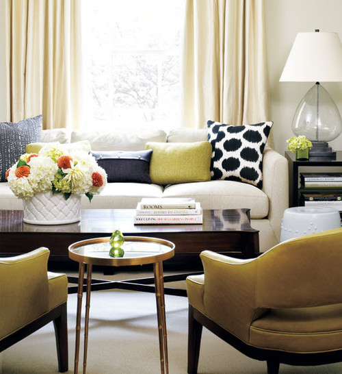
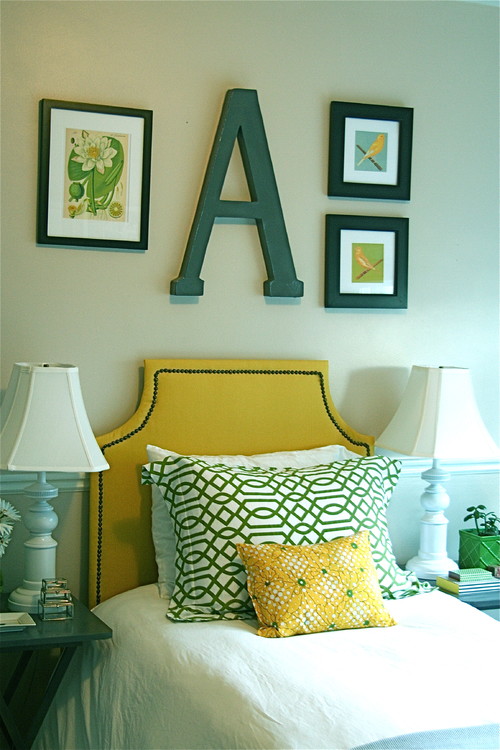
As in most Color Pulse forecasts there's something for everyone. The grays are still prevalent, as are the purples from last year. Yellows seem to be moving more toward the gold which isn't surprising with the current trend to brass and gold away from silvers in metallics.
houzz
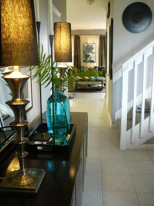
There's a range of greens from silvery to teal tinged. An obvious pairing is green with the heavier yellow golds.
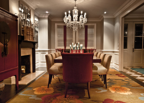
Reds range from the feminine to orange tones.
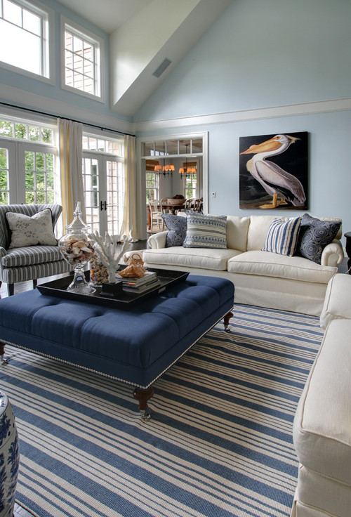
Blues are experiencing a resurgence.
From the four categories above I'm personally attracted to Protection and Enlightenment. I like my colours light and fresh and my neutral preference has always been gray- long before it gained popularity.
What are your thoughts?


Tidak ada komentar:
Posting Komentar