Tampilkan postingan dengan label styling. Tampilkan semua postingan

Kamis, 13 November 2014

Two Apartments In Modern Minimalist Japanese Style (Includes Floor Plans)

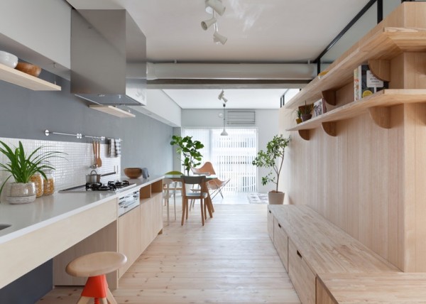
As we have explored before, the Japanese style interior design aesthetic is highly tied to the idea of minimalism and negative space. In these two small apartments, you will see that there is truly nothing there that does not have a purpose. The spaces never feel cluttered or cramped, no matter what the actual area measurements. Instead, air and energy can easily flow from room to room in a relaxing and comforting way. Natural wood is another common element in Japanese design, and both of these spaces use it to great effect. Combined with swaths of sunlight and warm, light colors, even a small space can feel open as well as orderly when utilizing this style.


The first apartment is a renovation, done by the team at Sinato Architects. The house is known as Fujigaoka M and is more than two decades old. The purpose of the renovation was to create a space that was both more modern and more comfortable for the married couple who was to live there.
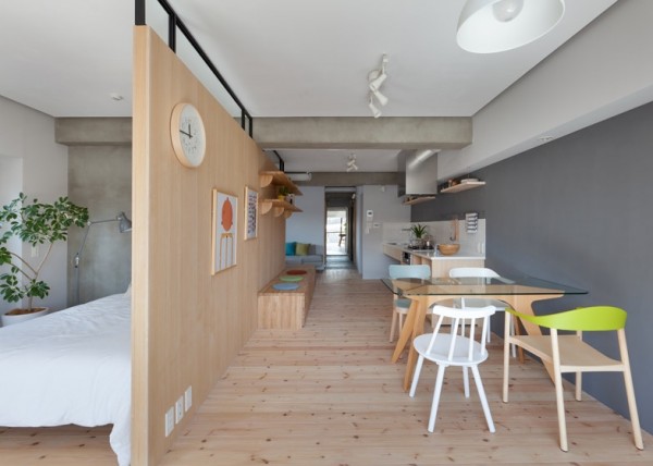

The architects sought to make the house more open and give it the connected feeling that comes with living as a couple.
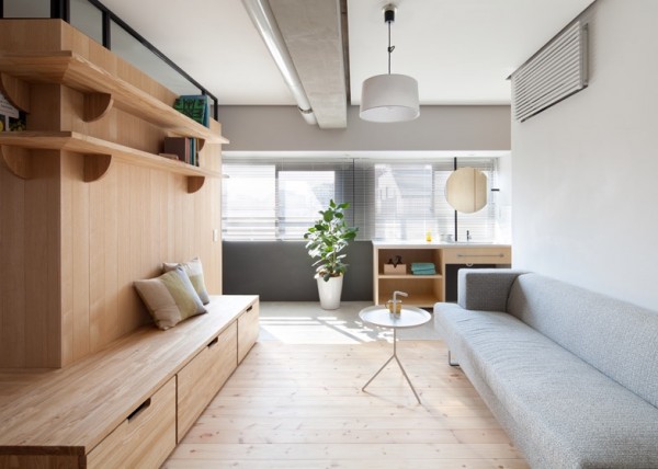

None of the rooms in the home are closed off by walls and doors. Instead, half walls create some division and necessary privacy while sunlight from two sides of the home is allowed to flood in.


Of course, the use of sturdy natural wood, for the inner terrace as well as furnishings and flooring, is distinctly aligned with the Japanese aesthetic, giving the entire space a warm and cozy glow.
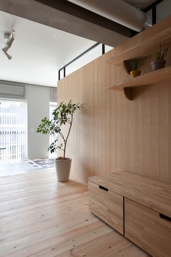

The central portion of the house, referred to as the “inner terrace” by the renovators, acts as a room separation but does not close anything off. Instead, it offers space for storage as well as display walls for personal photos, art, and books. The central wall therefore becomes a personal element of the house that is easily updated for seasonal changes or the occasional redecoration.


The second apartment is also a renovation, this time of a 75 square meter (800 square foot) home in Western Australia. The renovation was undertaken by Clare Cousins Architects and was necessary to make a warm and open home for a young family who was expecting their first child.
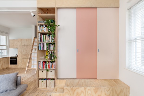

With such a small space for two adults and soon a child, an effort was made to minimize the sleeping area while maximizing the living space. This meant that every element had to be truly necessary, in the Japanese style, and when possible each space had to have multiple functions.


This was partially accomplished through the use of sleeping cubbies, that are no larger than a mattress. These areas can be closed off at night for privacy, or during the day to hide the bedroom away.


A young family of course will also want to be able to entertain on occasion and perhaps have overnight guests. The lofted area of the apartment accomplishes that goal with a spare guest bed as well as access area to hidden storage compartments. The lofted storage is actually home to more furniture, made from plywood, that folds flat to save space.


Moveable partitions throughout the home give residents the option to change the layout as they see fit, from day to day.


A simple but chic bathroom uses clean white tiles and gold plated fixtures for a modern and minimal – if not traditionally Japanese – look.


Fan of the Japanese style? Do check out these then.

Selasa, 22 Mei 2012

Taming open shelves

 Are your selves like mine?  They start out beautifully arranged and over time bits and pieces of things end up store there, and soon you have a  messy jumble.  If you are someone who can relax in a space no matter what is going on in it, perhaps a jumble of objects  doesn't bother you.  I'm not like that.  If my environment is in a mess that is how my head feels. 

Here are 5 great tips to  bring order to unruly  shelves.


Vary sizes of objects 


One of the simplest rules when arranging vignettes is to have a range of object sizes for variety.  Some should be small , some medium and at least one piece that is large. And remember to layer to create interest.  Put a tray at the back and then stack  books and a small object on top of them. If you layer artwork make sure it is actually visible.  There's nothing more annoying than using art work in a display and then covering it up.

Use repetition

Hillgrove Project traditional living room

Bookcase Accessorizing eclectic living room 

Repetition, when used well, creates a strong design. Choose several elements to repeat throughout the bookcase/shelving. If you have one stack of books laid horizontally, repeat this arrangement in at least two other places.  Use small sculptures, boxes or vases and rest them on top of a pile of books or magazines.

Keep it neutral 

 shelf-style-overall.jpg

When you have a range of objects to store,  one of the best ways to keep things looking pulled together is to choose neutral colour schemes.  I love white objects for this purpose. You might also consider silver, brass, wood etc.   There's a lot going on in the space above, but because everything is white or very pale, a cohesive look is achieved.


 This neutral scheme allows the homeowner to display stored items in an interesting way.  Also notice that the organization on each shelf is organized in two sets with both having equal visual weight.


This is as neutral as you can get in both theme and colour scheme.I love the repetition of bottles and books with variety achieved through shape.

Keep interesting elements at eye level


This is an easy one and it really makes a difference. When you walk into a room , you tend to see what is at eye level first.  Don't forget about "seated" eye level  too.  Keep boring objects toward the bottom.  Also remember that if you have a line of books or really dark objects they will have a lot of visual weight and should rest at the bottom of the display.

Create relationships

 Living eclectic living room
 
Choose a common element when you arrange shelving.  It could be similar colours, shapes or content/theme. Choose objects that relate to one another in colour and/or shape to create unity. Vary the size of objects and make sure they relate to each other in some way. In the images above the common theme is containers interspersed with art work.
Related Posts Plugin for WordPress, Blogger...