Minggu, 17 Juli 2011

High contrast

Do you like dramatic colour schemes? They have too much energy for me to live in, but I certainly find them attractive and I love the edgy a dramatic combination  produces. Contrast always demands attention and there's nothing like a combination of white and black to add high drama to a room.  Getting the colour balance right and finding interesting textures are challenges that must be overcome when you set out to command interest in any room. There can be degrees of contrast in a white/black scheme;  some are toned with the addition of grays or are heightened by the addition of a bold accent colour, some are white with a little black and some are black with a little white..

Perhaps you will be inspired to take the leap and create a white and black decor.  These rooms should provide lots of inspiration. 

front door view to stair contemporary entry
Mark English Architects, AIA

What an entrance!  Don't you wish you could visit this  house? 


And now for the view from the opposite end. 


There's no doubt that the geometric rug is the eye catcher in this design . Even the patterned drapes are forced to play second fiddle! The simple hotel bedding calms down the energy of the room and adds a splash of brightness.


Kelley Proxmire of Kelley Interior Design  creates tailored traditional interiors.  Many of her designs show an "appreciation for the fresh sophistication of white and the daring elegance of black". Strong black walls set the tone for this dramatic bedroom with colourful shell patterned accents.  

And now for the other side of the room.... 
Kelley Interior Design

Christine Ralphs and Michelle Lloyd make up a dynamic design team (Ralphs Lloyd Design) as you can see from the high contrast rooms I've highlighted below. 


 In this one white is the predominant colour with just enough black to provide contrast. The addition of the yellow flowers adds a simple but commanding touch.

Lloyd Ralphs Design

The addition of soft gray white on the walls  of this bedroom provides a soothing backdrop for this mostly white design. The splash of yellow again - just enough to provide a touch of energy.  

Lloyd Ralphs Design

 This is another room anchored by a dramatic area rug.  When you choose something this strong you've already established your future selections.  Note the touch of yellow  in the paintings.

Showhouse contemporary family room
Dillard Design Group, LLC

Red is another colour frequently seen as an accent with white and black. This room has just enough of it for my taste.  Judicious use of red with black is important to prevent that bordello look you probably wouldn't want to have in your house.  Love the artwork. 

Tobi Fairley


 Black with a hint of green in accents is one of my favourite combinations.  Designer Greg Natale  has created beautiful rooms black and white rooms with just touches of green. 


 Greg Natale


When you view the portfolio of Sydney designer Greg Natale  you quickly recognize that he has a way with using black and white and subtle accents of colour.  In this  room it's green in the rug and repeated again in the ferns. 

 Greg Natale

Greg Natale

Have you noticed that one of the elements present in many of these  high contrast rooms is a strongly patterned area rug?

White with some black, black with a little white, white and black with a colour accent... Which do you prefer?

Kamis, 14 Juli 2011

Choosing bedside tables

I am not fond of bedroom suites  or sets of anything really.  It is so much more interesting to see a well collected room where individual pieces have been thought out  with each piece adding individual notes to the overall design.  The minute you decide not to buy a  complete set you  have to start thinking about what, how many, how high, what colour,  etc.   Wonder no more!  Here are pointers that will help you choose interesting and design friendly furniture for your bedside. 

How High?
Your bedside tables  should not be so low that they look dwarfed by the bed  or so high that you have to reach way up to turn on a lamp. When your tables are the same height as your mattress (my preference) they provide a pleasing visual line all the way across.

AbbeyK, Inc. traditional bedroom
Abbeyk, Inc.


These mirrored cabinets make great bedside tables.  They reflect the colours around them adding additional interest and provide plenty of storage.  The height makes them easily accessible from the bed with tops wide enough to hold lamps and other objects.  Although they are large they do not look large because of the mirrored surface - a great addition to any decor.   
 
The most important thing to consider is the scale of the table when compared to the bed. If you have a king size bed you need a larger bedside table ranging from 20" - 40" wide.

A table should not be dwarfed by a bed.

Malibu Mediterranean mediterranean bedroom

When you don't have much space it if often better to go without a table .  In this situation the table isn't functional because there isn't any room to place anything on it. 

 A three drawer chest usually works out well as a bedside table for beds that have a higher headboard.  It would not be visually pleasing to have the top of the chest and the headboard the same height.


Bedroom eclectic bedroom

Habachy Designs contemporary bedroom
Habachy Designs


Modular furniture usually has a  bedside table lower than the mattress but the lines of the platform integrate the tables into a cohesive unit.

Do they have to match?

Not in my book.  I think it looks more interesting when bedside tables don't match, but it is more difficult to know what to put together. 

Bedrom traditional bedroom
If you  choose matching bedside tables consider using a padded headboard to break up the matching wood tones.
 
HGTV

HGTV


I like to pair a rectangular table with a round table especially if the bed is near a corner on one side. 


LAS VEGAS home  bedroom

 In this room one of the bedside tables is a  desk which could also convert into a dressing table. Multi-functional furniture provides many options in a smaller home.

What else could I use? 

Centsational girl traditional bedroom
Centsational Girl


The covered table has been around for years but with a glass top it continues to look soft and elegant when paired with more traditional  furniture.

Guest Bedroom. eclectic bedroom
Michelle Hinckley


Shelves attached on either side of a bed is a real space saver in a small room. 

Boys bedroom traditional kids


Trunks and suitcases make great bedside tables.

HGTV


A coffee table  is a great idea.  I like the way the three photos mimic the three pillows on the bed.  This type of repetition helps to control the scale of the coffee table.


The Urban Un-Martha 


In a country home a high chair does not look out of place as a bedside table.


Canadian Cottage traditional bedroom

Another great option for an informal look is a small kitchen table  with folding sides.  I like the way the lines support the slanted lines of the roof. If I could change one thing I would have a lamp with a little more volume and height.

Summer Home contemporary bedroom

Attaching peeled logs together once cut to a standard length makes a very interesting bedside table.  Depending on where you live this could be a very inexpensive solution especially for a more rustic/cottagey decor.

Sabtu, 09 Juli 2011

5 Kids' window treatments with a twist


There are so many fantastic ideas for economical window treatments.    Here are 5 of my favouites from Better Homes and Gardens website that could be used for kid's rooms.

 Fun and Funky Buttons

You can buy jars of mismatched buttons for very reasonable prices and have a field day decorating drapes for kids'  rooms.  Glue them on rather than sewing them which is time consuming. This idea would not work in a young child's room for safety reasons.
buttons                                                         


 BHG
Geometric Borders

Follow the link under the photo for ideas on how to apply these fabric diamonds to a plain panel.  You could also make a diamond stencil from cardboard and paint the diamonds with fabric paint.


Princess Sheers 

This is such a cute idea for a little girl's room to  add richness and softness to plain drapes. I like the application of the diamond belt buckle for that extra bit of glitz. .  Check the Better Homes and Gardens  link for directions.


 Velvet Ribbons

Dress up any draperies with velvet ribbon applied using washable fabric glue.Nothing beats white for a fresh crisp look and lots of colour options. 

 Name stencils

Purchase large letter stencils to decorate draperies.  The vertical application on one side is interesting and unexpected. Trace the letters with a pencil and paint inside the lines. Great for a boy's room.

Senin, 27 Juni 2011

Take a closer look


 The room above works because of its mix of various materials with a neutral palette.   I kept returning to  beauty comma  to look at it over several days.  When you are drawn back to a room it is worthwhile to examine what aspects of it you like.  That was easy for me in this case- everything. 

Why does this room work in my view?

  • blond woods are my favourite and have always been since I was in my twenties- no ebony or mahogony for me. I like my wood to integrate with the other elements in a room, not stand out. I like to use wood for its texture, not colour.
  • clean lines allow your eyes to move over an object and  on to something else.They create visual flow in a room which works to create a  relaxing atmosphere.  Boxy is better in my view because these lines seem to fit/follow the envelope of a room .  Rectangular shapes can be softened by  accessories and softer textiles.
  • sculptural shapes  are added in the lamp, vases, boxes  and rock like structures in front of the window. There are other shapes hiding. Have a closer look. The selection of these accessories were not done in haste because they play perfectly with each other. This room depends on sculpture as an art form.  Notice there are no two dimensional art pieces on the walls. 
  • variety in  textiles (pattern, texture) is a must to support a mainly monochromatic room. The play of the striped rug  against the furry one  is wonderful. 
  • the absence of jarring colour makes this room a calm retreat.  It is a room I could spend many hours in and still find it interesting because of the texture and shapes.  Less is always more in colour. 
  • bringing the outdoors in by minimizing window treatments and utilizing the glimpses of nature as art.
What about this room in comparison?


It has many of the characteristics noted above but a much darker palette.  Texture and sculptural forms are dominant.

Matt Costigan via Decoria

Jumat, 24 Juni 2011

Style like a pro -Texture


 Colour is the most obvious element in interior design because of its boldness or starkenss. Homeowners constantly update their rooms with colour changes, but what about all the other design elements?  For example, have you given your room a texture update lately? Texture is simply using a variety of  finishes in a room and it is easily improved by varying the composition of products in a room, e.g., glass,  woods, metal, plastic, cotton, velvet, lacquer, leather, ceramic. etc. Stop and look around you. How many different materials have you used in your room? What's your room's texture quotient? 

  Texture is the element that gets constantly overlooked  because its effects are subtle. It's one of those things that you take for granted when it is done well, but it's difficult to identify if it isn't , You just know the room looks boring, but you're not sure why. Layering textures gives a room interest and depth.

Jessica Helgerson  a Portland, Oregon  designer, is a master of texture. Many of her designs, typically clean and uncluttered,  rely on the richness of textures for visual interest. 


This mid-century modern split level ranch house takes on a new life under her skillful direction. The overall feeling is restful and outdoorsy. Furniture choices reflect the style of the home. The vintage finds were reupholstered  in light fabrics of varying textures. The coffee table made from salvaged maple is the center piece of the room. Its irregular edges and smooth surface plays well with  the Portuguese eel traps hanging over the fireplace mantel . Glass is prominent in the French demijohn bottles and ceramic Chinese garden stools are tucked into the room.  The woven area rug stands out against the smooth ebony floors.


At the end of the living room, the dining area continues the themes already established. You get a clearer view of the ceramic Chinese stool and the raised texture on the pillows.  The leather chairs work well against the high gloss wood table.  Plants, vegetables and wicker all work to enhance the  this welcoming room.  Metal chair legs show up well against the ebony floors. Glass and ceramic are evident in this room too. One of the musts in texture usage is to play matte and gloss surfaces off each other with one being more dominant -usually matte. The textures and colours of the outside also play an important role in this room's success.


Continuing with the white and green theme, this high contrast  bathroom has a lot of texture punch for a small space, Wood, metal, marble, ceramic, glass,  paper, and fabric are blended seamlessly to produce a room that wows.

And now a little quiz... how many textures are combined to produce this stunning master suite?

Selasa, 14 Juni 2011

5 Window Treatments for Patio Doors

"What can I do with my patio door?" Since I often hear this question  from clients I'm  concluding  that sliding patio doors provide many challenges in home decor. If you are the proud owner of a patio door let's explore your options in window treatments. 

Fully Closing Draperies

living room contemporary living room
 When the door is on an end wall fully closing draperies floor to ceiling and wall to wall looks stunning. This layered treatment has  panels and  sheers with both sets of draperies movable (you can tell from the layered rod treatment).  If you wanted to get a similar look on other than an end wall , place your drapery rods 18 - 24 inches beyond the window surface  extending the visual width but also allowing the panels to sit on the wall rather than over the window. Another way to decrease the cost is to have the side panels stationery and have the sheers movable.

Sliding Panels 


Sliding panels  are a good solution for patio doors in a more contemporary setting and are available in a variety of colours and textures to match your decor. The panels slide under each other when open and you are left with one panel width at the side.  The vertical panels can range from 11 to 24 inches; the more panels the less glass  is covered when  they are open. Sliding panels are available in a wide range of materials  providing  varying degrees of privacy and light control. 


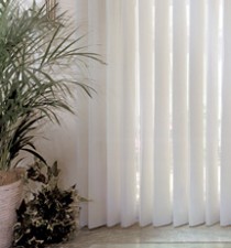
Sheer verticals


If you want to combine the traditional look of sheer draperies and the functionality of vertical blinds choose sheer verticals. The under structure is a vertical blind but the  sheer fabric that covers the vertical vanes brings this treatment to a new level. By simply rotating  the vanes you can go from light filtering to complete privacy.

 Sliding Shoji Screens


This is an unusual solution for a patio door but it is  a functional one.  A shoji screen has a wooden gridded frame with translucent paper inserted between the grids. Check out Shoji Design Inc. for beautiful designs.

 Plantation Shutters 


Bi-fold plantation shutters are hinged together and fold against each other, similar to a closet door. You can choose between panels that are free hanging or ones used with a track to guide and support them. Bi-fold panels can be configured to open to one side or to both sides of the window. 


Related Posts Plugin for WordPress, Blogger...