Sabtu, 09 November 2013

Design Solutions: A bed between two windows

Work is keeping me quite busy over the last several weeks and blogging always drops off when this happens.  I'm beginning a series of posts called Design Solutions that will  address common design issues that often crop up when I work with clients.This is a great way for me to come to  terms with options and at the same time it provides a written commentary that I can send clients to in the future.  If I can help my readers in any way, it's a bonus.

Being a lover of asymmetrical balance, I can't explain why I am so attracted to the placement of a bed between two windows.  But I am. The windows become part of a larger design tableau in such instances, and the whole wall must be considered as a unit including headboard, night tables, lamps, table vignettes, art, window treatments and bedding.   Here are several guiding principles to keep in mind.

 Keep it symmetrical


When you start with a layout that is symmetrical, it works best to continue using this form of balance in your design .


Consider  your headboard shape when choosing art

  No headboard

 The height  and shape of your headboard will dictate what you place over it .  When you have no headboard you have to choose something that will fill the space well, and circular shapes with lots of texture and warmth are brilliant.

High headboard

The pillows act as  the center of interest in this layout of high headboard framed by draperies.  No art is needed.


Many designers are attracted to  groupings of three objects (art) between two windows.  This is an option, but not one I usually advocate.  When there are too many rectangles my eye craves  something curved or solid. In this room  the art reaches the top of the windows filling the space in between thus making the windows, headboard, and art one large rectangle. 

Low headboard
Design Solutions: A bed between two windows

This is a beautifully designed space, both elegant and simple at the same time.   The headboard  is low and the six art works fill the space nicely.  It is always interesting how you can depend on one element or principle  of design to  negate problems with another one.  With all the lines in the windows you might expect  that 6 pieces of artwork would be overkill in this space.  Not so here.  The dark frames and lines in the romans make the window lines almost unnoticeable. Contrast always wins when vying  for attention.  The curves in the spectacular roman shades also provide some relief from all the rectangles.  I rarely hang roman shades from the ceiling, but in this case it works especially well.

Curved headboard

It is difficult to hang art over a curved headboard; it is often best to let the curves be the statement.  In this room a spectacular light fixture adds additional visual interest to the larger vignette.


And the exception to the rule... there's always one!  The lamps fill in the curves and the three pieces of art look especially good hung in a straight line.  It doesn't hurt that there is a circle in the headboard. The art is light and the bed becomes the center of interest in the room.


 Follow the lines of your curved headboard to place three pieces of art....


or use a round mirror or sculpture at the top of the curve.


Use window treatments to frame the bed


My preferred solution for a window treatment on matched windows is draperies.  They soften all the hard edges and make great frames for the bed and the night tables. Think about your table colour when choosing your drapes.  The tables should stand out not disappear. Yes, I would change the black, wrought iron rods! Love the simple pillow arrangement and circular mirror.


Consider using blinds behind draperies for privacy. and be adventurous when mixing designs  in the space. I think this combination works well because all the  patterns have the same colours.


Hanging a drape on the outside edge of both windows and using a shade of some sort is another option for a window treatment .  This solution opens up a small room and gives the bed more room to breathe.    The shades are the centre of interest in this room because they are so dark. Patterned fabric adds another element of interest.   I love  round night tables when there are two windows because they serve to soften all the straight lines.

If you want to maximize visual space keep your shades and drapes light and matching. Be careful when you choose rods for your window treatment.  Rods are functional and to my mind they should blend into the decor not make a statement that draws your eye upward. There's nothing else black in this whole room so why choose black rods? Check out a previous post on Choosing Rods.


Romans are simple and linear.  You would never call them soft, but they can frame a bed nicely when they are used in conjunction with tufted or other luxurious materials in a bedroom.  By choosing a simple monochromatic scheme these romans serve to move your eye around the room and allow the white window details to frame the bed.  The white art is a repetition of the the frames. 


 And why not make your window treatment the focal point in the room? Overload on draperies.


My parting comments:  This small  monochromatic space maximizes design in every way. If you want to put three art pieces above the bed it works best when there are soft draperies on either side.  The simple images and large white borders connect with the white bedding and lamps.  The larger white accessories are simple and perfect.   The dark furniture anchors the space and I don't even mind the black rods!

Links to all images can be found on my Pinterest board Bedrooms.

Jumat, 08 November 2013

A present for you from me!

I'm not one to miss a party but a few weeks ago My Scandinavian Home blog turned two years! Call this a belated birthday present but I wanted to celebrate by giving something back to you, without whom this blog wouldn't be anything. So I've been burning the midnight oil creating a present for you with the help of the talented designer Jennifer. And here it is: a 2014 calendar in nude and black for you to download and print off for free. If you'd like it.


My Scandinavian Home 

To download the 2014 calendar all you need to do is click each of these two links:

MSH Calendar 2014 part 1
MSH Calendar 2014 part 2

Save both files to your computer (there's six months on each PDF) and print in colour on good quality paper (for optimal results use a professional printer).

Cut around the edges following the lines if needed and either mount in a frame or simply use a swath of washi tape to hang it on the wall. That's it!

And again, thank you for all reading my blog and for all your wonderful comments here, on Facebook, Pinterest and Twitter. Here's to many more years of Scandinavian interior inspiration and discussions!

Since it's Friday and my blog birthday (sort of) here's a round up of the top five most popular posts ever shown on My Scandinavian Home:

A bedroom with a black wall caught the eye of A Cup Of Jo.

Swedish designer Elina Dahl's home tour took off like wildfire across Pinterest 

A post on my very own midcentury drinks trolley proved popular among SF Girl By Bay readers  (and it doesn't even stock drinks yet!).

It's no wonder the home tour of Danish By Nord owners was a hit with all its awesomness.

And finally, the popularity of this cute DIY project proved everyone on here secretly loves a dab of potato printing......

Have a wonderful weekend!

Kamis, 07 November 2013

A beautiful converted barn

Hello....nearly the weekend -yay! I promised a surprise today but unfortunately it won't be ready until tomorrow, I'm really sorry! I hope the inspiration from this beautiful house makes it up to you until the project's ready. This converted barn appeared on the Swedish TV show Hustoppen last year and appeared on the lovely Purple Area (a fellow Skåne blog) today. I'm in love with the white wood paneling and beams, concrete floor, little nooks, vintage furniture and linen covered sofas. How about you?


Via Purple Area

Have a lovely Thursday and see you tomorrow for the surprise.... 

Rabu, 06 November 2013

A beautifully simple home with green floors

I'm always showing homes with white floors, black floorswood floors and even concrete floors. But what about green floors?! This surprising twist to an otherwise (beautiful) simple, white Australian home looks utterly fab and tells us that perhaps we need to think outside the usual colour scope? To get the look it's important to balance it with other items in the same shade (note the green tap and accessories in the kitchen, vases on the dining room table and vintage scales by the fireplace). Love the mid-century furniture too...


Photography: Brooke Holm with kind permission. Stylist: Megan Morton for Inside Out via Coco Lapine with thanks

Could you go green? Or perhaps you've seen another colour somewhere you like?

I've got something exciting to share with you tomorrow so make sure you pop back.....oooo, what could it be?!

Have a lovely day

Selasa, 05 November 2013

A cosy interior space for a rainy day

Hi there! Posting from a very rainy London today, which immediately makes me want to withdraw inside with a nice cup of tea and some cool coffee table books. I'm thinking this beautiful space from the Norwegian home of Line from  Vintage Piken would be the perfect place to be this Tuesday morning. I've shown more of this beautiful space here - but you can never see enough of her home right?!


Vintage Piken
I love her style - the vignettes, the beautiful furniture, the photography. Perfect! And I want that cup! What about you?

BLACK SHEEP (WHITE LIGHT) sell the most amazing grey icelandic sheepskin pillows. They're often getting new items in so it's worth following them on Facebook to keep an eye on what's available. Top of my Christmas wish list!

Have a lovely Tuesday!

Senin, 04 November 2013

A stunning Dutch home blending old and new. And give-away winner....

Hello! I hope you had a wonderful weekend? I ended last week with a Dutch home tour and this week I'll start with one too (talk about going Dutch!). This one hundred year old farmhouse owned by Rosemarijn van Zandvoort of Skattejakt (check out her beautiful shop and blog) has been carefully restored using a blend of old and new. I think the old world rustic charm of the beams and wooden floor against the Scandinavian blonde wood and white walls (and a touch of poured concrete) looks truly fantastic, how about you?


Photography: Margriet Hoekstra with kind permission. Styling: Rosemarijn van Zandvoort Barbara Natzijl, VT Wonen Via The Style Files with thanks
l often look around my open plan sitting room and dining room area and think I have thrown together to many different types of wood. But when I see Rosemarijn's home it gives me confidence that everything doesn't need to match. How about you?

Try here for stunning aged / reclaimed wood floors.

Thank you so much for all the wonderful entries into last week's give-away to win a Ferm Living Candleholder String from Nest. I wish you all could have won, it was so much fun reading your lovely comments. I am excited to announce the winner: Bene Artuphel please send me a mail with your address so we can organise the shipment.

Have a lovely Monday!

Minggu, 03 November 2013

Thoughts on decorating coffee tables

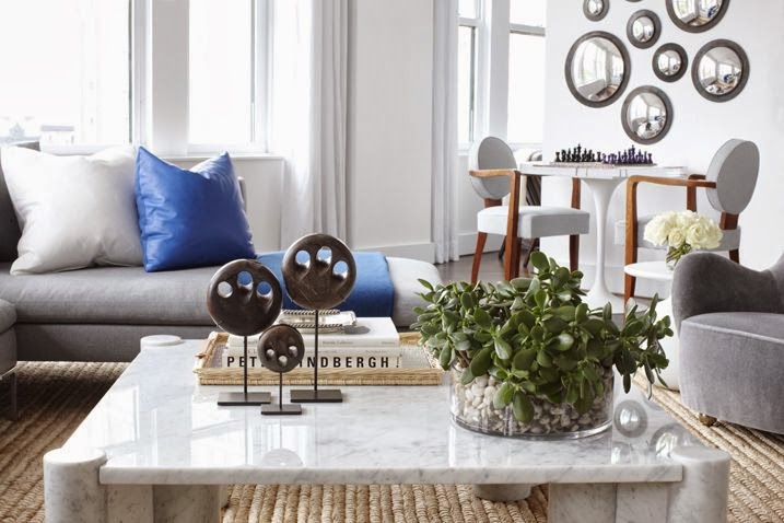
Now you may be surprised  to discover that some people  (especially decorators) put a lot of thought into turning a coffee table into a work of art!


   I frequently admire the sometimes over the top arrangements (vignettes or tablescapes to decorators) found in many decorating magazines and online portfolios, but they rarely seem practical to me.  First and foremost, a coffee table is a functional item that provides a place to lay  drinks, nibbles etc., but  I do agree that it is a flat expansive surface that calls out for some adornment.   How far you want to go with this adornment is up to you. 

Thoughts on decorating coffee tables Designing Home
Margaret Ryall

This is the most I have ever had on a coffee table and there was still lots of room for drinks and cheese. My ceramic  bird finds various homes around the house. You never know where he  might pop up.  Books are always great props if you don't go overboard. They provide  height, colour and text as design elements.  

Everyone should have one great bowl .  Mine is from IKEA and it can always be found on my coffee table. Sometimes it has a vase of flowers added, 
 

 or Christmas ornaments  or gourds,  ... you get the idea.  So a great looking bowl of some sort is a very practical solution that you can keep changing.  I like silver  and low because everything looks great with it. 


Here are some other great bowls....


Ceramic vases especially white ones are also great additions for every decor.  I particularly like small ginger jars or fret work jars. 


Mixing metals is very in right now and having a gold or copper bowl really warms up a space.  When you have a large coffee table you need an equally large bowl to keep the scale working. This is a very  "masculine" look.  Consider small globes, gears, wooden sculpture, carved boxes, magnifying glass, etc. for masculine additions.

 The ultimate bowl coffee table combination :) from Phillips Collection.


Next....

Margaret Ryall 

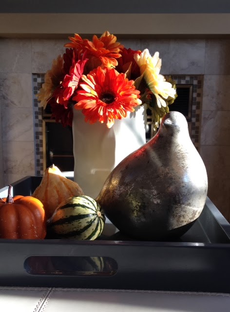
is the versatile tray.   When you arrange objects in a tray and you want more space you simply lift it off the table.  This is a very simple fall arrangement on my coffee table/bench in  my family room.  Note Mr. Bird has moved rooms. The paper bag ceramic vase in grayish white is another of my staples.  It gets filled with all kinds of things from twigs to candles.


Three candle holders of varying heights are very versatile for  your decorating needs. You can change the colour of the candles for seasonal events. Natural elements like coral and flowers always add texture and a little of the outside world.  Think about starfish, shells, ferns, twigs, grasses, etc.as natural complements to glass and ceramic. Heights and textures add interest and move the eye around.


Very simple and effective selection of objects in white and black. I like the fact the tray is wood which instantly warms up the collection.  A sphere of some sort is also a versatile object to own.  One with texture is even better.

And don't forget plants...


...with a little sculpture thrown in.  I have been looking for something sculptural to add to my small collection, but nothing has appeared yet.

Hope you found some ideas for your space.....

Jumat, 01 November 2013

A touch of Autumn in a stunning Dutch home

Hello November! Are you off to enjoy the Autumn colours this weekend (those of you in the Northern hemisphere at least!)? If so pick a branch or two for me. After all, who needs flower shops when the most beautiful plants and flowers are right outside our door*. Here's some inspiration from VT Wonen, and the beautiful home of Nevin Polat, Bart Luth and daughter Neval Nisa in Groningen, Netherlands.


Styling: Cleo Scheulderman, Photography Jitske Hagens /wij zijn kees with kind permission. VT Wonen. Via 79 ideas with thanks. 
Pretty beautiful don't you think? Clean, white, simple and nicely styled.

If like me you're thinking of adding a touch of Dutch style to your home you might also want to check out this, this and this inspiration. Fab!

Have a wonderful weekend and don't forget to enter the give-away (last day Sunday!).

Oh and apart from announcing the Ferm Living candleholder winner on Monday, I have another surprise for you next week too....I hope you'll like it! Exciting!

*Note : always check first before bringing a plant into your home, especially if you have young children. Some species can be poisonous. If in doubt consult an expert. Thank you to Melinda Ruge for highlighting this too.
Related Posts Plugin for WordPress, Blogger...